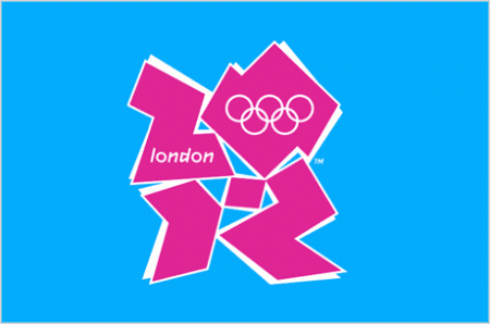
Creative Debate: London 2012 Olympic Logo

Would love to hear what you all think about this logo that’s generating a lot of love-hate out there. Weigh in for our first creative debate!!!
Explore posts in the same categories: Fonts/Design
Would love to hear what you all think about this logo that’s generating a lot of love-hate out there. Weigh in for our first creative debate!!!
Explore posts in the same categories: Fonts/Design
June 30, 2009 at 2:23 am
ICK!
June 30, 2009 at 2:36 am
hate it. Makes me want to lay out on a hot pink raft in a cool blue swimming pool sipping lemonade. No friendly competition there, unless you want to race me to the margarita pitcher 🙂
london and the rings look like afterthoughts.
June 30, 2009 at 3:02 am
I like it! Challenging in a deconstructiveness kind of way. Very unconventional…wouldn’t expect anything less from the brits!. Reminds me of listening to James Brown on acid back in ’82. Rock on!
June 30, 2009 at 3:15 am
I don’t care for it. I kind of think it was designed for something else and wasn’t used, so they slapped on the rings and called it the Olympic Logo.
June 30, 2009 at 3:20 am
It makes me feel like I’m looking for something in a hidden picture from “Highlights.” But there’s nothing else there. Just a weird stylized “2012.” Couldn’t they have incorporated something neat into the shape that says “Great Britain” or “world uniting” ? I guess I just don’t GET it.
June 30, 2009 at 3:26 am
It’s janky as hell—but, I think that’s the idea! The days of wine and roses are over and the world is like a big mis-matched jigsaw puzzle right now. So, maybe it’s all about going to “London” and for a brief period being ONE world together—regardless of the fact that we’re a bunch of pieces that don’t necessarily fit together. I thnk it’s challenging us on purpose…and making us talk about it, therefore achieving something else other than—oooooo, ahhhhhh—greeeeat design. : )
June 30, 2009 at 3:27 am
It’s janky as hell—but, I think that’s the idea! The days of wine and roses are over and the world is like a big mis-matched jigsaw puzzle right now. So, maybe it’s all about going to “London” and for a brief period being ONE world together—regardless of the fact that we’re a bunch of pieces that don’t necessarily fit together. I thnk it’s challenging us on purpose…and making us talk about it, therefore achieving something else other than—oooooo, ahhhhhh—greeeeat design. : )
June 30, 2009 at 3:28 am
oops…posted twice—wasn’t trying to get my point across by repeating myself
June 30, 2009 at 3:30 am
Hadn’t thought of it that way… definitely makes me think of it differently. Not sure that I am sold though 😉
June 30, 2009 at 3:36 am
Nor do you have to be “sold”…I immediately see rules of design broken…maybe I’m just reading some symbolism into it that’s not even there and it IS just a bad design. But, it reminds me of the kind of stuff I do with my own art sometimes—so, that’s probably where I’m coming from.
June 30, 2009 at 3:40 am
Just had a buddy of mine tell me that it reminds him of the “Saved by the Bell” intro.
June 30, 2009 at 3:53 am
Love the convo around this. So fun. I have to admit (and I’m rather embarrased to) that it took me awhile to read the 2012. But the colors are quite summer-y, though I wonder where the pink came from. I would love a behind-the-scenes take on the thinking behind this logo.
June 30, 2009 at 4:00 am
Just found this on their website site explaining their brand identity:
“Our emblem is simple, distinct, bold and buzzing with energy. Its form is inclusive yet consistent and has incredible flexibility to encourage access and participation. It can communicate with anyone from commercial organisations to kids playing sport.
It feels young in spirit. Full of confidence, certainty and opportunity. Not afraid to shake things up, to challenge the accepted. To change things.”
June 30, 2009 at 4:46 am
I knew it—they wanted to challenge people and shake things up.
March 3, 2011 at 2:52 am
Olympic 2012 Logo update:
This is crazy!
The secretary general of Iran’s National Olympic Committee has filed a formal complaint with the International Olympic Committee to get rid of the 2012 Summer Olympic Games logo and to confront its designers because the logo spells Zion, which means Jerusalem, which means the games are a pro-Israeli, anti-Irani conspiracy. ESPN has the story.